9/27/11 10:00 AM
.................. COMM-LINK 002 ESTABLISHED….................
What’s crackin’!
It’s Tramell “T.Ray” Isaac, Senior Art Director on PlanetSide 2™. In last week’s COMM LINK you met some of the core dev team leads; this week we want to switch gears and focus on the art style of PlanetSide 2. Currently, a majority of our team is comprised of artists, including concept, environment and character artists, 3D modelers, animators, tech artists and 2D graphic designers, to name a few. These artists have been diligently working on the paramount task of defining, and in some respects, re-defining the art style of PlanetSide 2. From this lens, we would like to give you a better understanding of how the overall aesthetic of the game will come to fruition throughout the course of development. But first a bit of background on me, just so you know where I’m coming from:

Seventeen years ago I started in the video game industry as a 2D animator. My first game was a title for Interplay, Blood and Magic. I think that sold like 7.5 copies…My second title started out as Steve Jackson’s GURPS. I believe most of you know this product by its true name, Fallout. Fallout 2 and Icewind Dale followed and a few short years later I began working on the original PlanetSide and all of its expansions. We had an awesome time working on original PlanetSide, and even though most of that team has moved on to other companies and games, we are still very close to this day. Soon after SOE released PlanetSide: Aftershock, I decided it was time for me to move on. I then went on to work on Neverwinter Nights 2 and Duke Nukem Forever. But SOE couldn’t take me being gone so long, so once again I returned and joined forces on The Agency. Now it’s time to make history again with PlanetSide 2.
The groundwork we put into the original PlanetSide established the foundation for much of the look and feel of PlanetSide 2. The original PlanetSide started out fairly simple in its visual approach. I came onto the project after about a year of production. A few things had been loosely defined, but there wasn’t a final cohesive look and feel to any of the factions, buildings, weapons, or vehicles. We started small by refining the look of the Terran Republic (TR) and the New Conglomerate (NC) characters, and then moved to the Vanu Sovereignty (VS) faction which had been designed but not created on the art side. By associating the factions with basic geometric shapes, we found a simple way to create visual opposition. We ended up with Circles (TR) v. Squares (NC) v. Triangles (VS). These shapes are simple and straight forward which works really well for player identification.
The iconic faction colors were also something that we played with, but ultimately chose Red for TR, opposing color Blue for NC, and combined them both to make the Purple of the VS. We needed colors that stood out on the screen for easy friend or foe identification. With the Vanu Sovereignty’s main color being so dark, we need a color that complimented purple that was vibrant and wasn’t used in the other two factions. Teal was the color we went with for these reasons. Once all the basic shapes and colors were established we took those cues and expounded upon them for the vehicles and weapons. The buildings were another story as they needed to have a nonspecific look that players could immediately recognize and not mistake for their own or as constructed by an opposing faction.
For PlanetSide 2 we took the origins of the factions, buildings and environments and re-imagined them with today’s technology. The buildings and structures now have more depth and detail. We took a look at what was created in the original game and re-developed it to fit the needs and aesthetic of the current gaming landscape. You will definitely see some familiar cues from the original bases in the buildings that we have re-visualized for PlanetSide 2. Each facility will still be identifiable as it was represented in the original game but with a modern twist.
 |
 |
 |
 |
The basic style cues for each faction are still intact. The Terran Republic is the faction that started it all. Their shapes and design are formed from circles and smooth lines. The TR look is more refined and sports some wear and tear but never looks overly used or secondhand. Most of their armor, weapons, and vehicles are constructed of composite materials that require a more sophisticated manufacturing process.
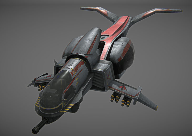
Terran Republic Mosquito
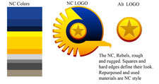
In contrast, the New Conglomerate is a bit less refined than the TR. The NC base look is derived from squares, rectangles, straights and 45 degree angles. The NC are a resourceful bunch, which is important in maintaining an older set of vehicles, armor and weaponry. Although NC weapons aren’t the most advanced, they ARE lethal just the same. NC armor will be chipped, dented and dinged but never compromised. The weapons and vehicles are worn but well maintained, something like your dad’s ‘77 Oldsmobile.
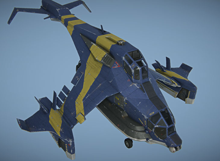
New Conglomerate Liberator
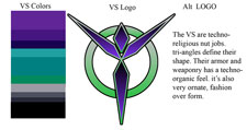
The Vanu Sovereignty is the most technologically advanced empire in the PlanetSide Universe. The VS are worshippers of the ancient technology found throughout planet Auraxis. I would say that they are more like an extremely powerful religious cult with energy weapons. As with some religious structures you would see things that are fairly ornate and somewhat extravagant. VS armor, weapons, and vehicles appear to be fairly contemporary with very little wear or damage. The VS is symbolized by triangular shapes and angles. Armor, weapons, and vehicles sport a carapace like shell layered like the plates of a lobster.
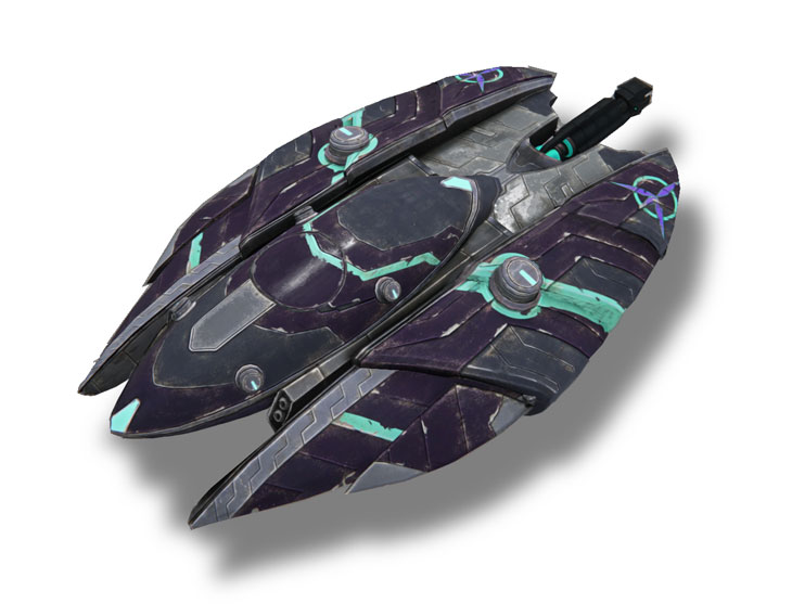
Vanu Sovereignty Magrider
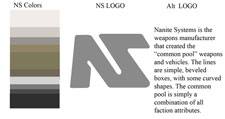
New to PlanetSide 2 is the manufacturing company Nanite Systems (NS). NS created all the common pool vehicles and weapons. They are the PlanetSide equivalent to Stark Industries in Iron Man. We created NS to add an additional element and background story to the planetary war. Visually, NS is very generic Sci-fi. There is nothing particularly unique about the NS items; their colors are warm grays with off white and tan to accent. NS shape language is taken from the combined shape language of the three empires. NS weapons and vehicles can use straights, 45 degree angles, some curves, with some shallower angles incorporated into the form. Nanite Systems hardware is built to last not for flash.
SOE’s ForgeLight Engine™ has allowed us to bring the PlanetSide universe to life in a way that could not have been realized until now. The environments for PlanetSide 2 are the star of the show. We are working hard to give the players game environments that are immersive and believable. Much like the original PlanetSide, we will offer up a wide variety of ecosystems to wage war upon. Continents like Indar will present the player with a vast desert wasteland with canyons that stretch as far as the eye can see. Dust storms will plague the landscape. As the suns set, watch the shadows stretch and fade into the night. PlanetSide 2 environments will be “living” worlds. The battles will not only be about battling the other empires, they will also require the player to strategize against the continent itself.
Ok, enough of this bulljive. I have to get back to making the most bad-ass MMOFPS that you’ve ever ‘done seent’. I hope you enjoyed my little nugget of info about the art style of PlanetSide 2. For more information on the subject, please join us this for this week’s Webcast and Twitter Chat (info below). Until next time my friends, T.Ray signing off.
Tramell “T.Ray” Isaac
Senior Art Director, PlanetSide 2
@PS_TRay
“The Art of PlanetSide 2” Webcast
Tune in Thursday, September 29, 2011, at 4 PM Pacific time for the second PlanetSide 2 webcast on our Stickam channel. Join host Linda “Brasse” Carlson for interviews with Art Director Bill Yeatts, Art Director Matt Broome, and Senior Art Director Tramell Isaac.
“The Art of PlanetSide 2” Twitter Chat
On Friday, September 30, 2011, starting at 4 PM Pacific time the PlanetSide 2 Development Team will host another Twitter chat to answer your questions, live! If you would like to participate in the PlanetSide 2 Twitter chat, make sure to follow @PlanetSide2 on Twitter.